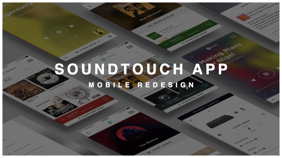
SoundTouch Mobile App Redesign
Interaction Design Lead — Bose
2015-2016
Bose had been making speakers for fifty years. The brand had just come through a full refresh. The industrial designers had just finished a four-thousand-dollar home theater product with glass custom-sourced from Europe — the kind of decision a company only makes when it believes the object deserves it.
Then you'd open the app.
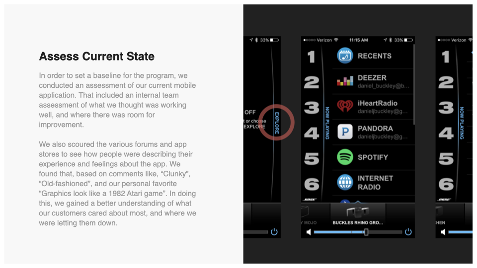
It wasn't bad, exactly. It worked. That was sort of the problem — working was the whole ambition. It was called the SoundTouch Companion App, which tells you precisely where it sat: alongside the real product, helping it function. Nobody had thought to ask whether a companion could be held to the same standard as the thing it accompanied.
So I partnered with the app's product manager and we made a case. Not for a redesign — for permission to find out what it would take to bring the app up to the level of the audio, the industrial design, and the brand.
The case wasn't a design argument. Nobody buys a Bose speaker because they want a speaker. They buy it because it renders the thing they love most in the most beautiful way anyone has managed — the speaker is the means, and the music is the end of the story. Every part of the company already believed that about the hardware. The app was the one place we hadn't said it out loud.
We got the permission. What followed was a year.
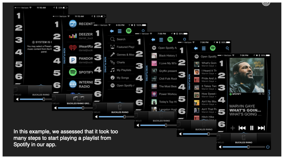
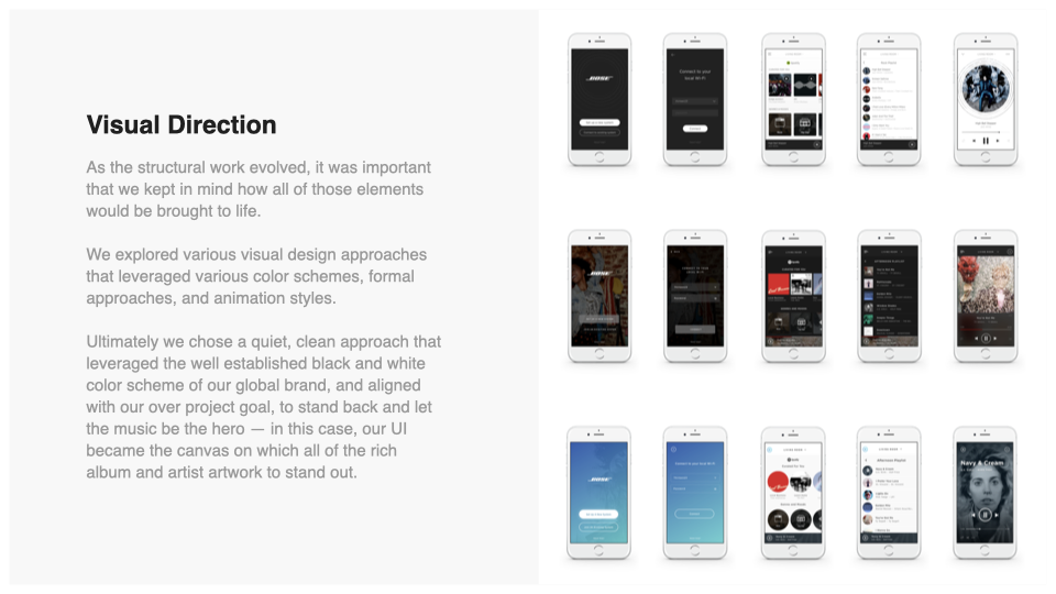
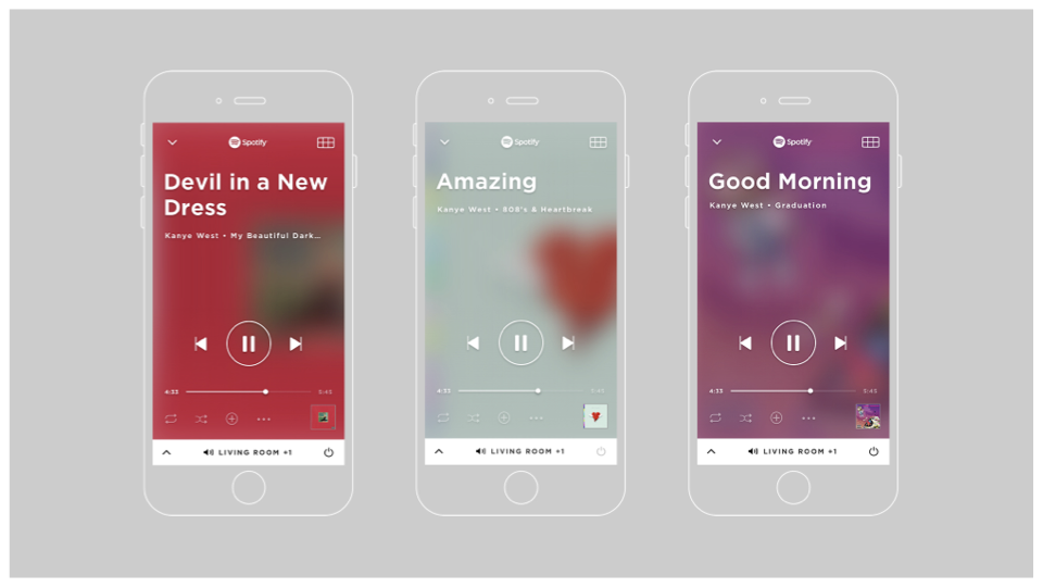
Speed to the music you love. Opening the app used to be work — a series of menus standing between you and the thing you already knew you wanted. We inverted it. Open the app, land on what you're most likely to be reaching for, play button already under your thumb. That isn't a navigation improvement. It's a different opinion about what an app is for.
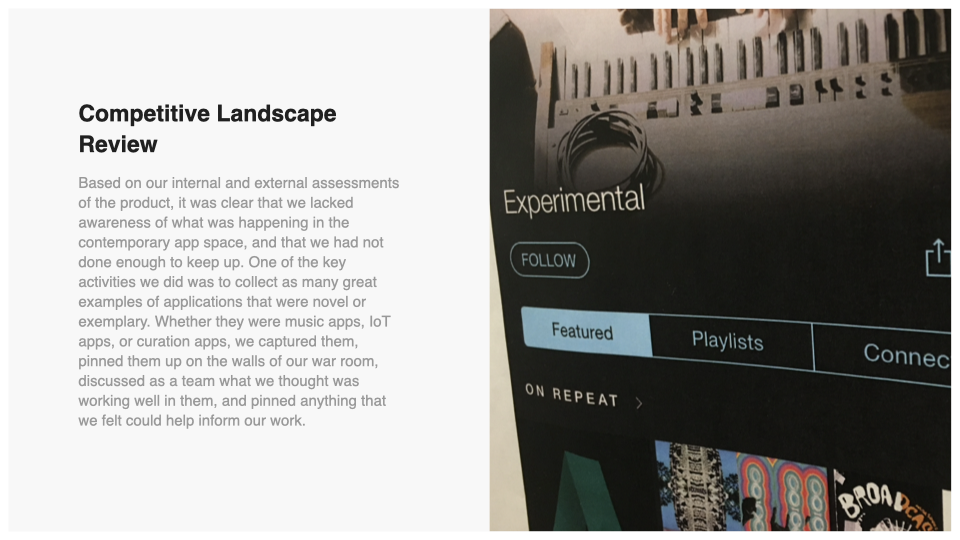
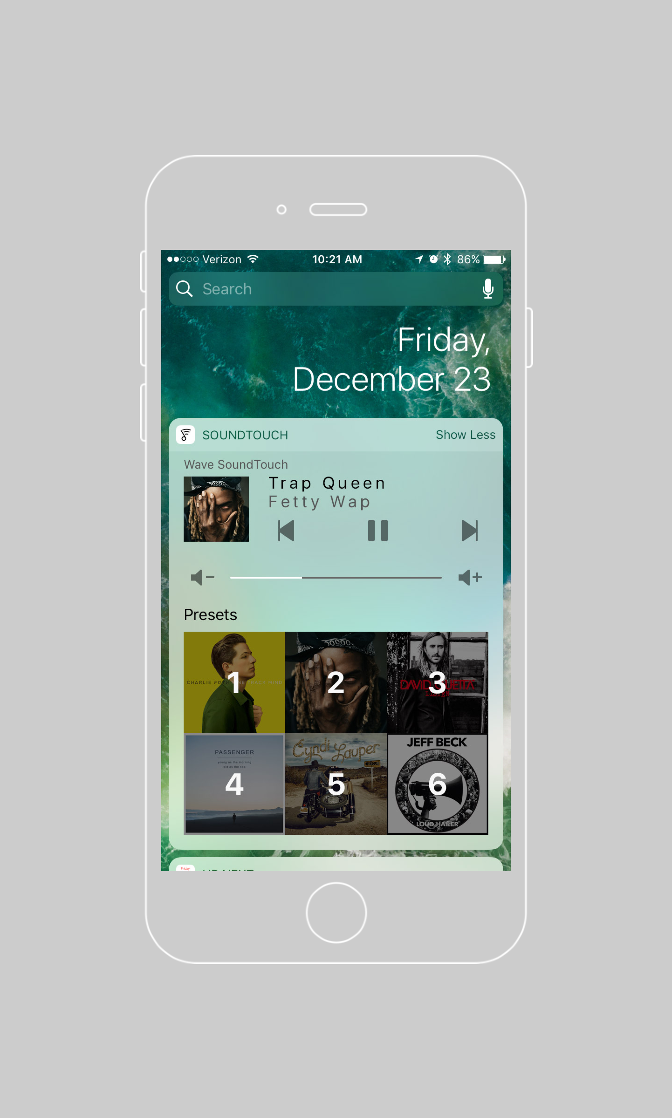
Music as the hero. The old app was a list of text, a utilitarian read-out of a system explaining itself — which is what you get when the people who built the hardware are also the ones describing the software. Our partner music services were already handing us album art that people had loved for decades. We gave it the room it deserved.
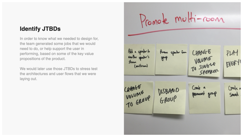
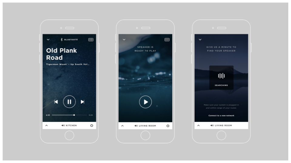
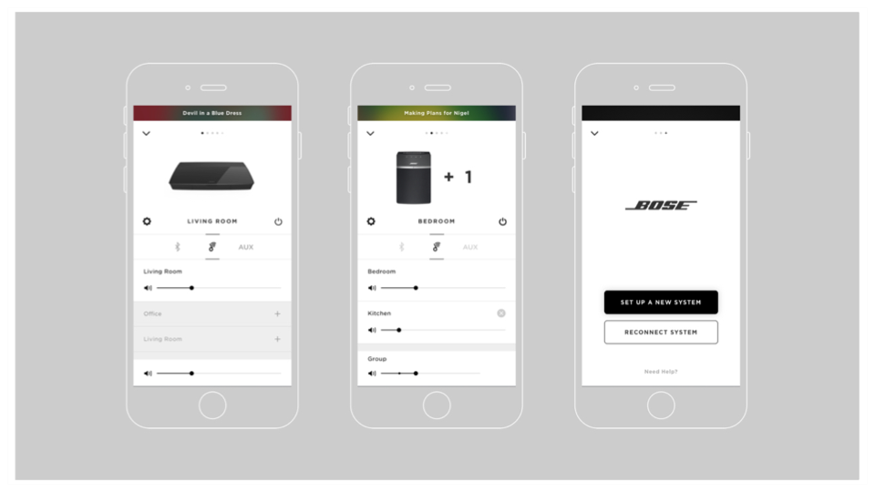
The constraint was that none of the utility could go. Multi-room, grouping, presets, settings — all of it had to keep working, and none of it could make the experience feel clunky or boring in the process. So it got re-framed rather than removed. The technicalities didn't disappear. They stopped being the subject.
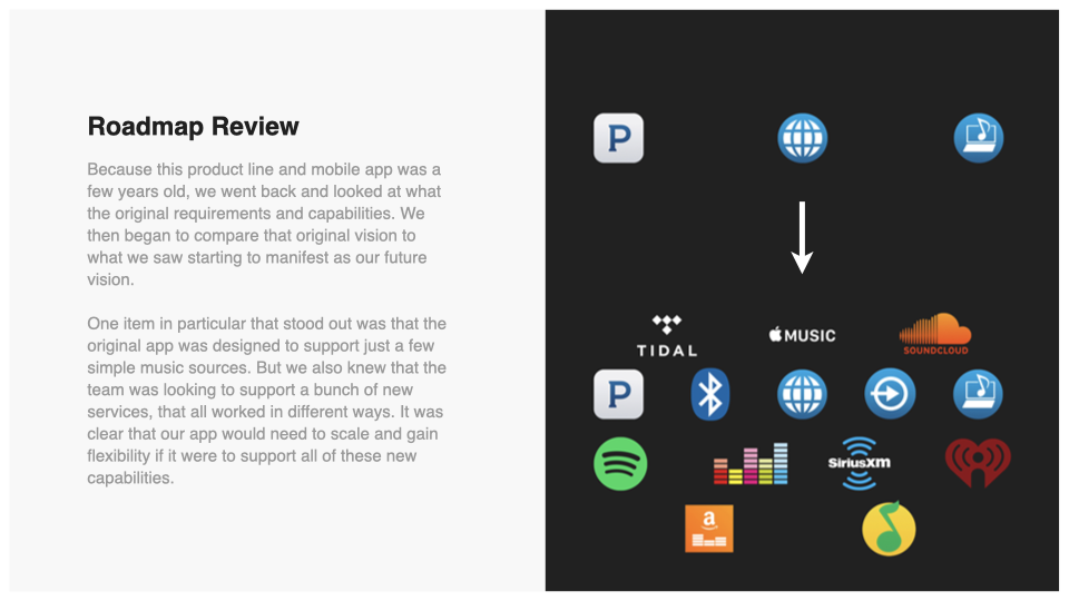
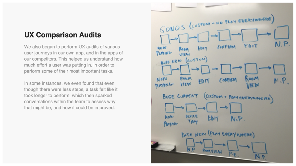
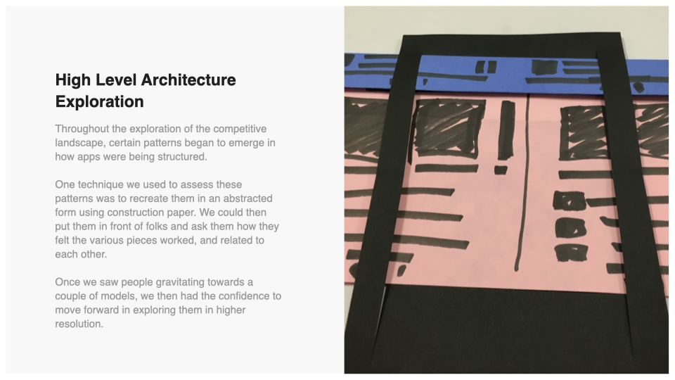
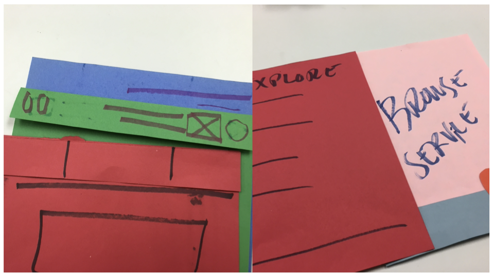
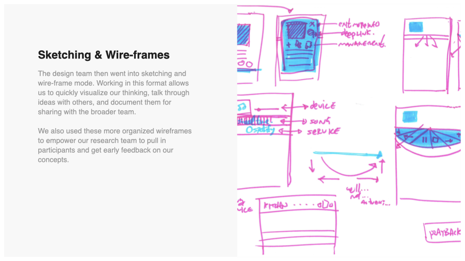
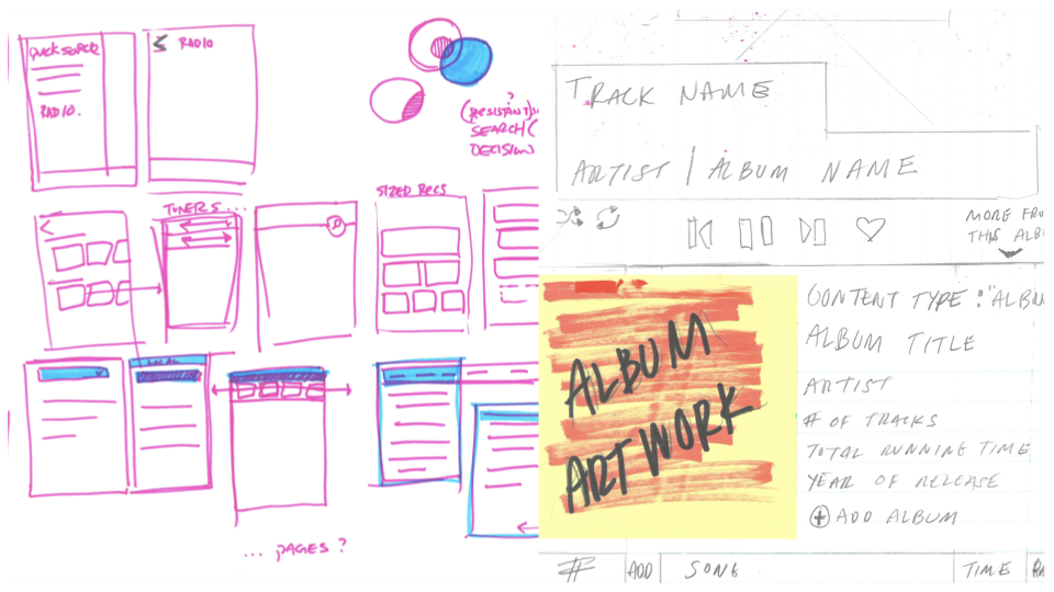
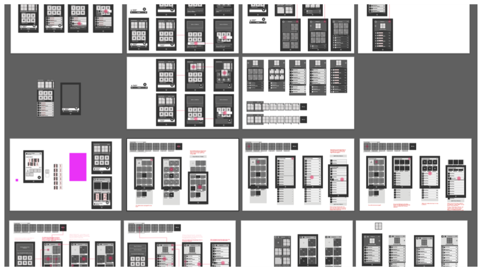
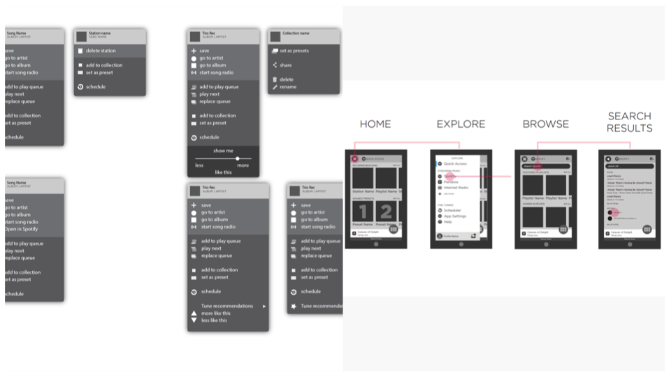
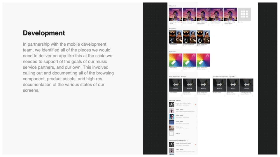
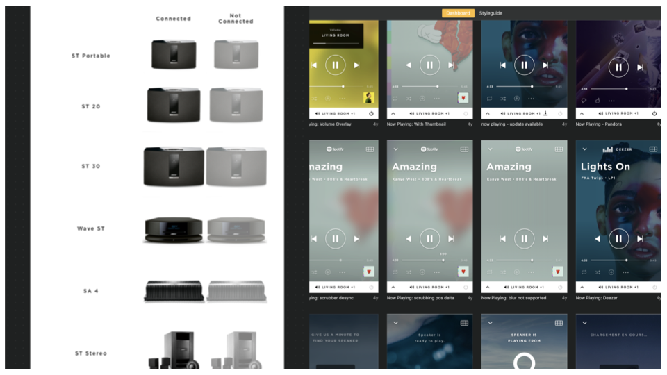
The work itself was a year of unglamorous things. We audited the entire experience. We built an entirely new information architecture from the ground up. And we built it to be built on — whatever we made had to carry five more years of features without needing to be torn down again.
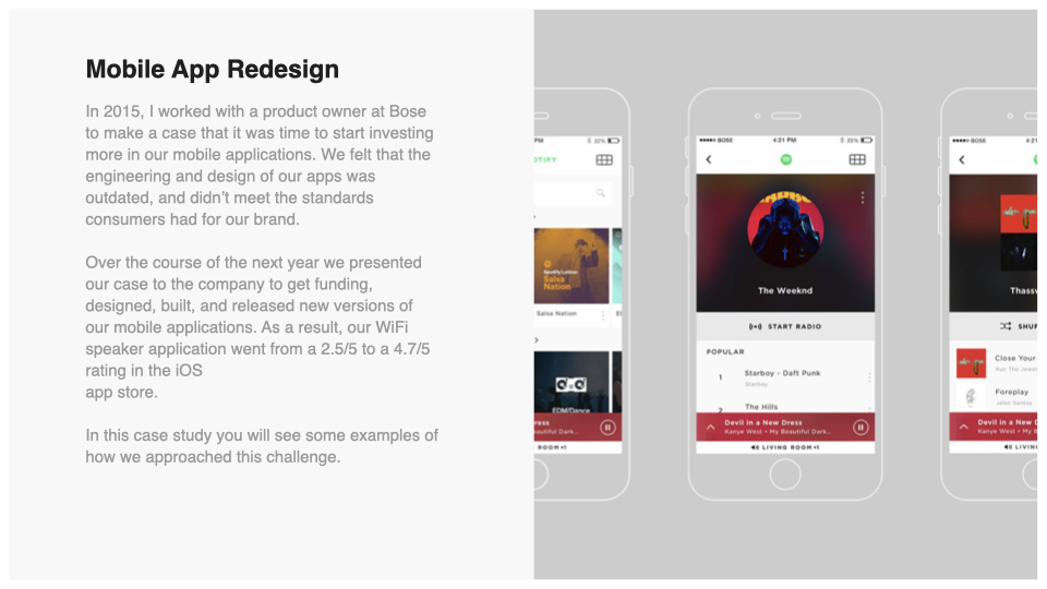
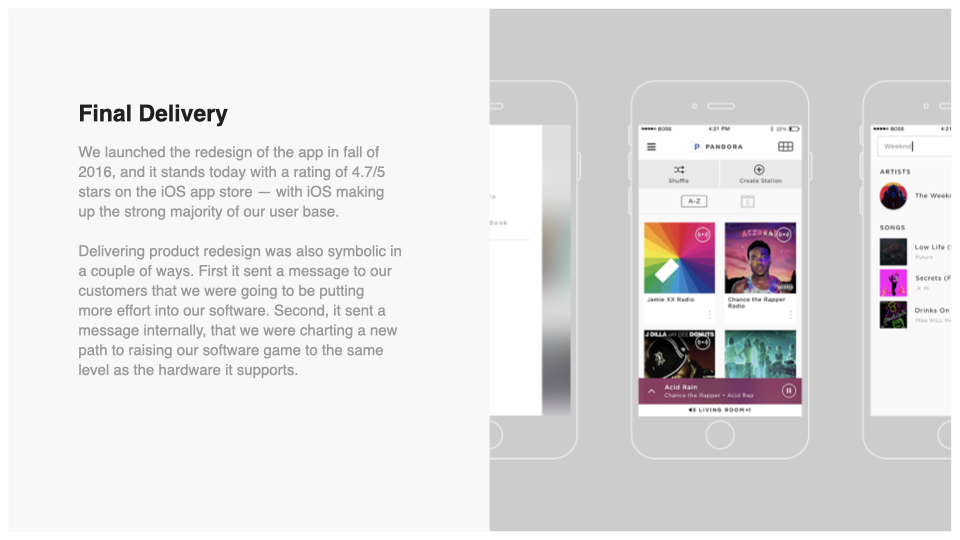
The App Store rating went from 2.5 to 4.7, across millions of people. That number mattered less as a score than as a proof: a fifty-year-old speaker company could make software worth the hardware.
And at launch, we dropped a word from the name. No more Companion. It sounds like a small thing. It wasn't. The app had stopped being the accessory that helped the product work and become part of the product — one of the esteemed set of parts that add up to Bose, held to the standard the glass was held to.
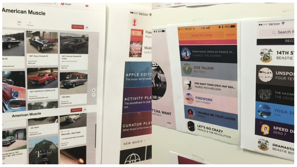
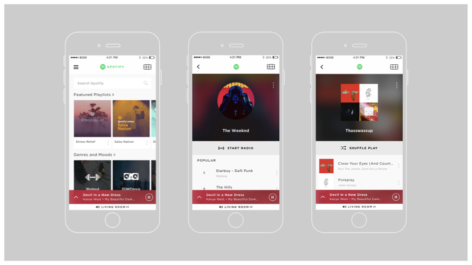
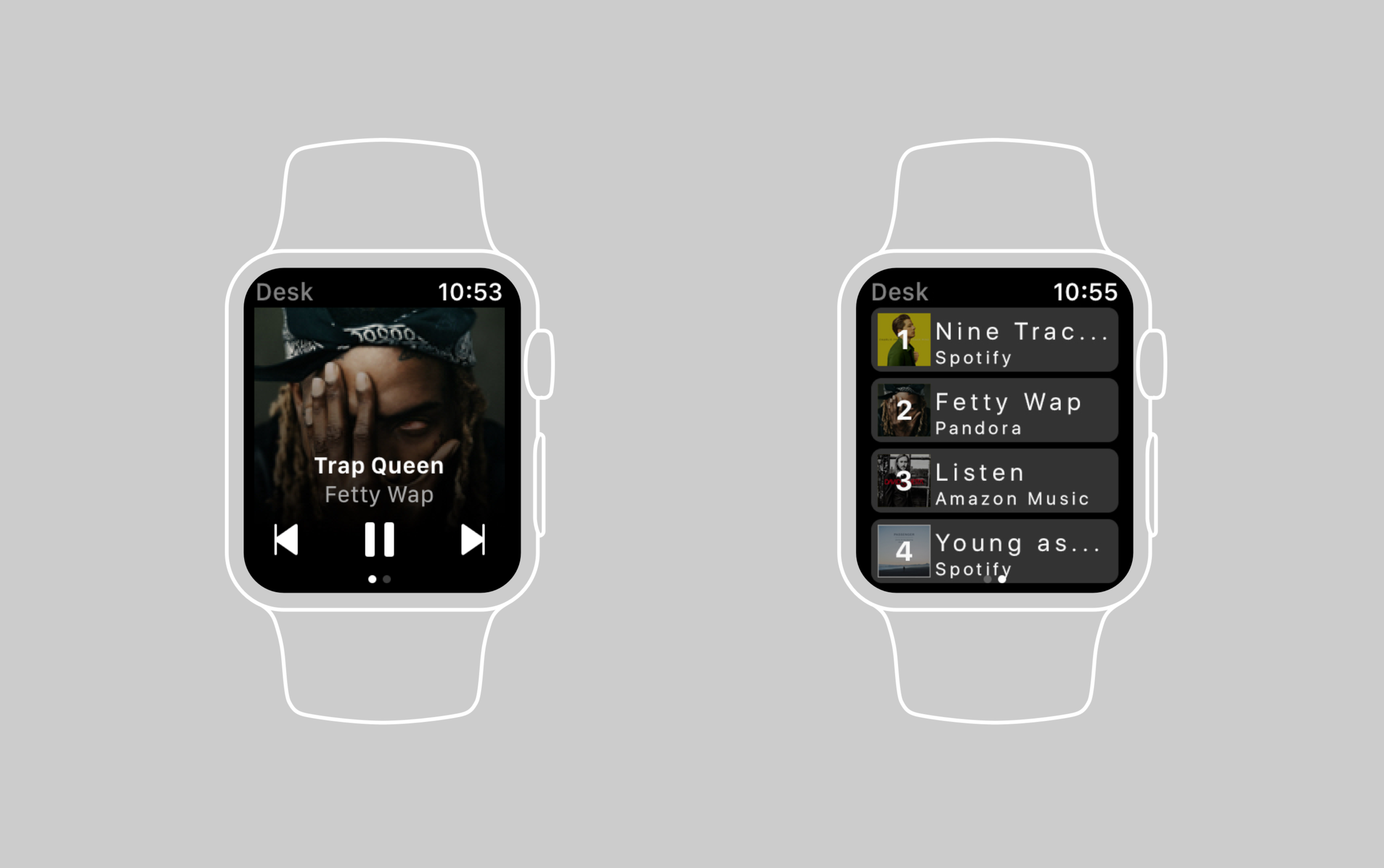
Below is some documentation of our process work, and example screens from the app at launch.