Smart Speaker Design
UX / UI Interaction Design Lead — Bose
2016-2018
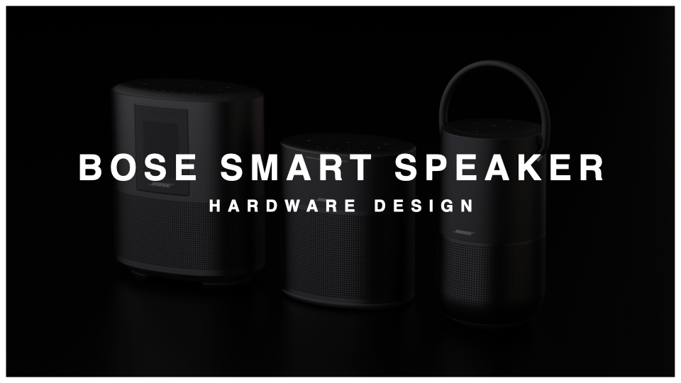
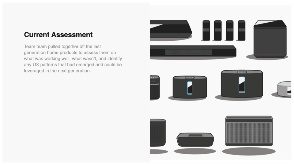
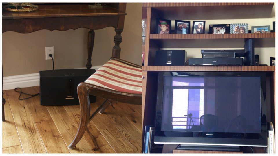
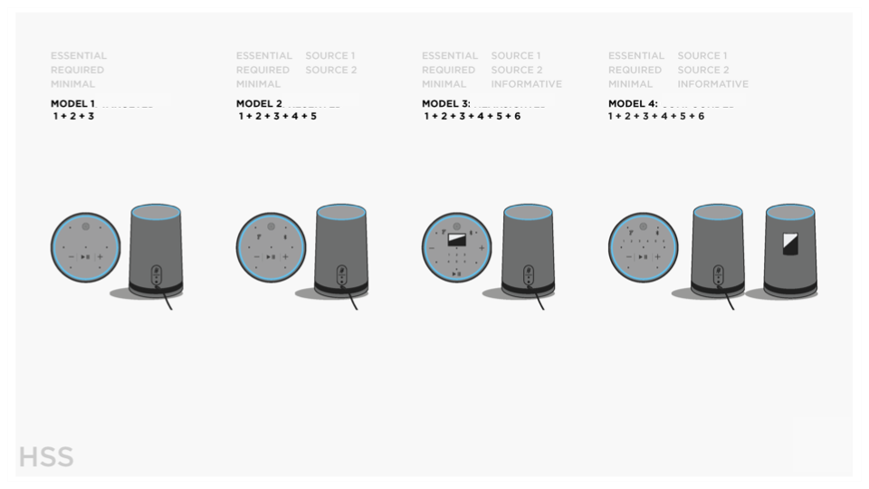
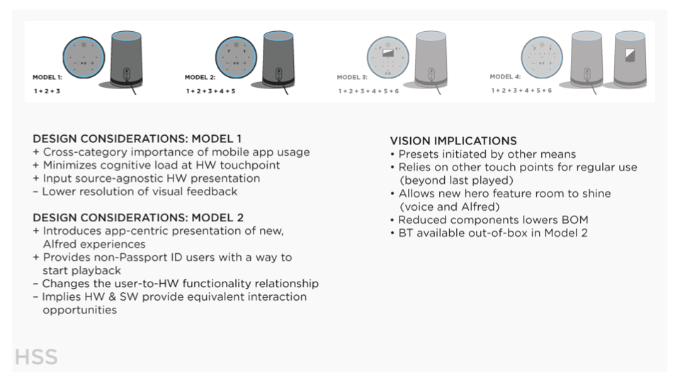
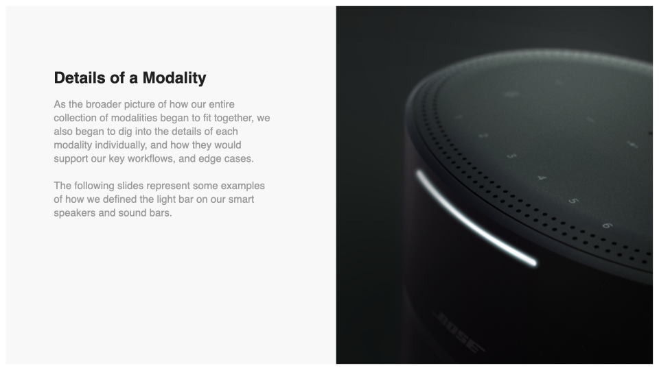
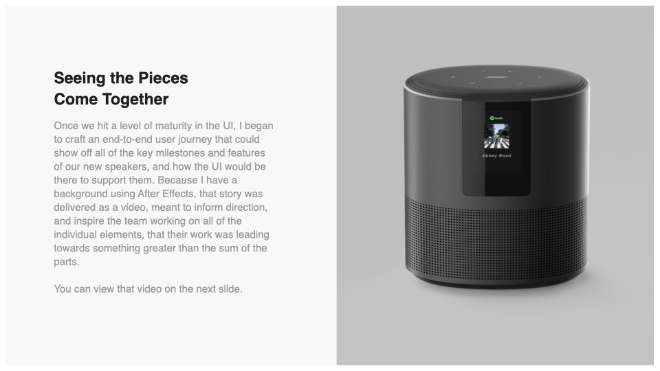
Five products across two categories. The Home Speaker 500 had a color LCD, a bar of light above it, six preset buttons, and a microphone kill switch. The 300 had the light and no screen. Then three soundbars, which had the light as well — plus a physical remote, a television to coordinate with, and a set of situations a speaker on a shelf never has to handle.
A person doesn't care about any of that. They say something out loud in a kitchen and expect the room to answer. The interfaces change from product to product. They should still feel like a family.
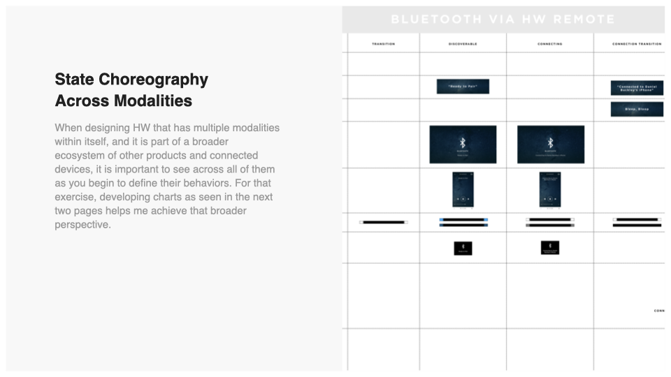
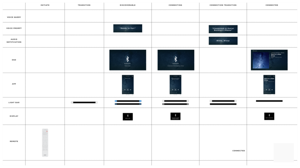
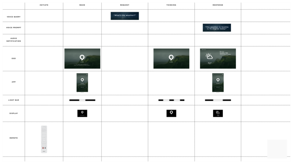
I owned the physical side: the input surface on the product, the visual language it answers with — LEDs and display — and the sound requirements, which moments needed to be heard rather than seen. The app had its own designers. What we built together was the choreography between us — who speaks when, what the object does while the phone is talking, and what the phone says while the object is thinking.
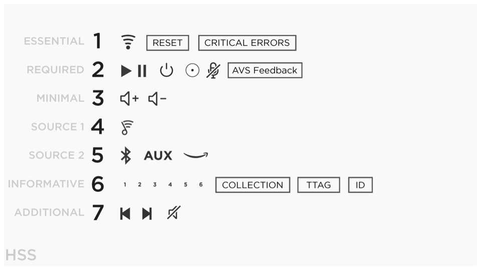
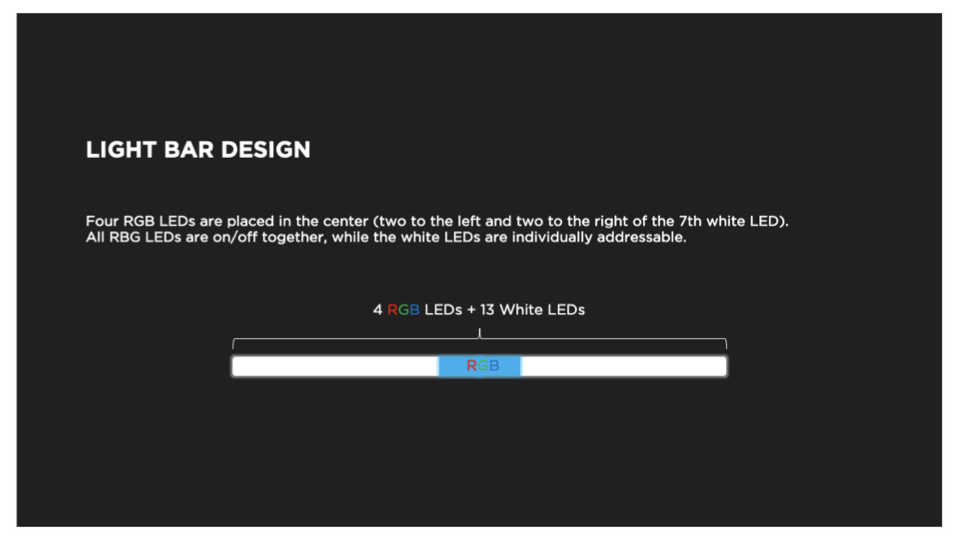
One language, five products. The language had to stretch in two directions at once. Down, as resolution fell away: the 500 had a screen for content and a dense bar of light for everything else, the 300 had the bar alone. And outward, as the soundbars arrived with a remote in someone's hand, a television in the room, and a set of things to say that no speaker on a shelf ever needs to.
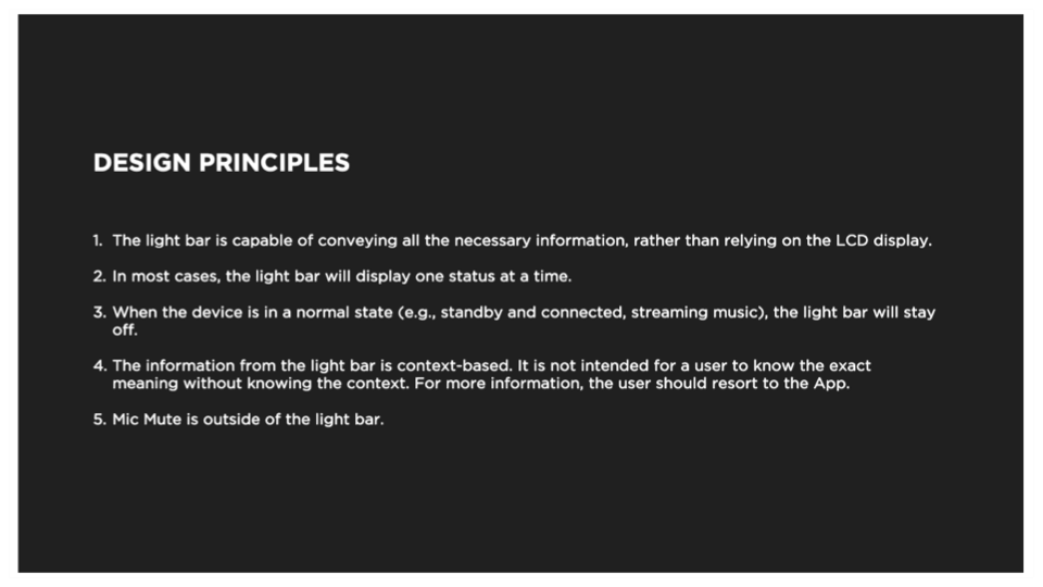
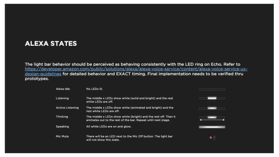
A phrase that reads as thinking on a dense bar still has to read as thinking when there are a handful of diodes to say it with. Which meant designing each one as an idea rather than as an animation, and then deciding what it's allowed to lose first — duration, or brightness, or the number of moving parts. Get that hierarchy wrong and the cheaper product stops feeling like a more affordable version of the same thing and starts feeling like a different company made it.
The goal was never that every product would say it equally well. It was that every product could say everything. On a screen the message reads on its own; on a single diode it may not, and we accepted that — what it stays is consistent, documented, and decipherable. And there was a fallback nobody else in the category had. This is a company that makes the finest audio interfaces on the planet. Wherever light ran out of resolution, the product could simply tell you.
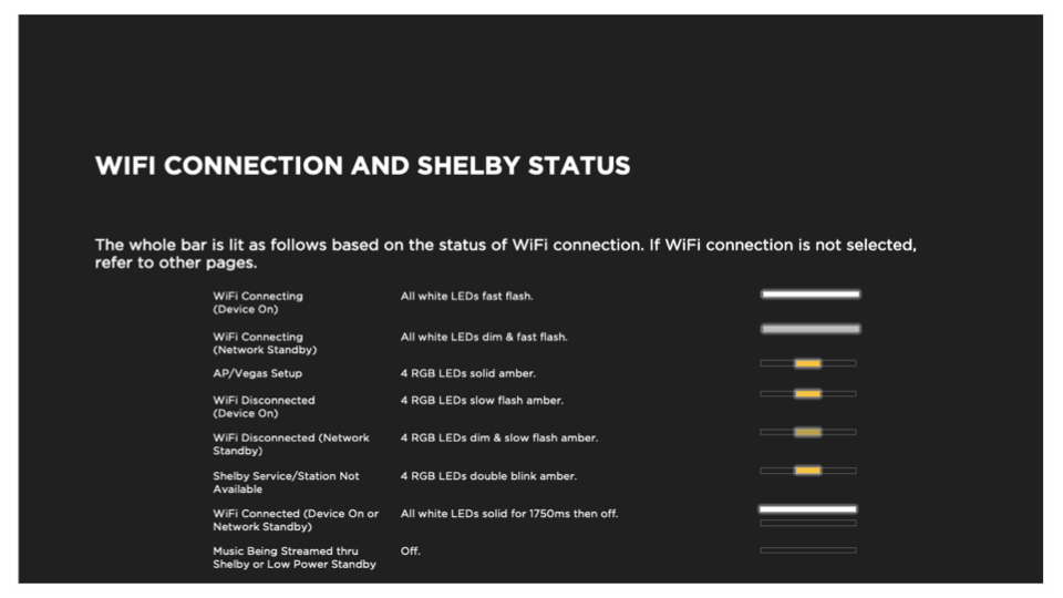
Setup was the hardest problem, and it's the part nobody puts in a portfolio. Getting a speaker onto a network means moving back and forth between a phone in your hand and an object across the room, several times, in a sequence neither one fully controls. Press this. Now look at the app. Wait for the light. Come back. Every handoff is a place where somebody decides the product is broken and puts it back in the box.
It's also long. Network, account, music services, a voice assistant, a firmware update — all of it sitting between a person opening a box and finding out why they spent the money. For a speaker, that reason is one thing. Hearing it.
So we moved that to the front. The first time the product powers up, before any setup begins, it does something: a burst of sound and light, the object coming alive in the room. Not a confirmation tone — a reason to keep going. That became Welcome to Bose, composed by Audio UX, and it's still what a Bose product does the first time you plug it in.
The firmware update is the same idea from the other end. A new speaker needs one the moment it gets online, and it takes long enough that a person watching it will assume something has gone wrong. So I worked with the app team to stop making them watch — start the update, give the light a clear job while it runs, and move the person to the parts of setup that don't need the speaker at all. Music services, voice assistant, all of it happening in the cloud. By the time we sent them back to the object, it had finished. The wait was always going to exist. It stopped being a wait once it was happening behind something worth doing.
Then the object hands the moment back. The first thing the screen says when setup completes is begin by exploring music in the Bose app — not a status, not a congratulations. An invitation. The work is behind you and the thing you actually bought is one tap away. Neither surface is the product. The product is the two of them agreeing whose turn it is.
Voice was the new modality, and it came with two landlords. Bose had never made a product you speak to. Amazon and Google had, and each arrived with a finished opinion about how a device should behave while their assistant is talking.
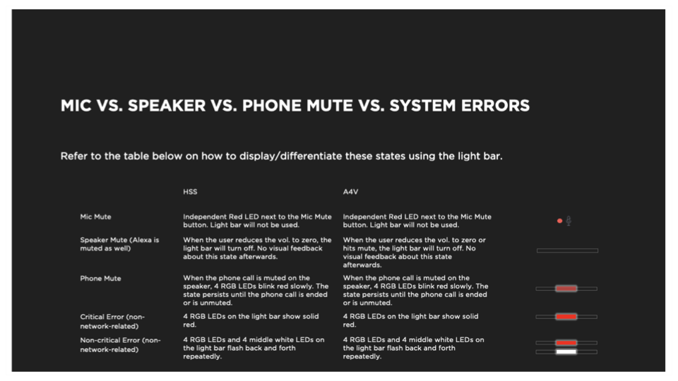
What the product still had to do for itself was carry the three moments that decide how a voice product is remembered: listening, thinking, and getting it wrong. The third is where products lose people, and it's the one that usually gets designed last.
And you chose your assistant during setup — not across the line, on the product. Alexa and the Google Assistant differ in what they have to say: one tells you a package arrived, the other tells you about a calendar event. They also differ in how they look. Each arrives with its own brand colors and its own LED color system, and both had to be negotiated against ours, and then against what the hardware could physically produce. Three color languages and a finite number of diodes.
Three problems, one goal. A visual language spanning five products, a setup split across two devices, an interaction model serving two assistants — in each case the system holds the whole matrix so that no one person has to. You buy one speaker. You set it up once. You choose one assistant. The other four products, the assistant you didn't pick, every path you never took — all of it designed so you'd never know it was there.
Video documentation of the end-to-end setup and primary use cases experience
Presenting the initial UI strategies to the product engineering organization