Multi-modal System Design
Principal Designer — Bose
Three product categories. Wearable audio, portable out-loud audio, and in-home — speakers and soundbars. Each with its own form factors, its own input types, its own feedback mechanisms, its own reasons to be picked up in the first place. Each scaling up and down by price point, which multiplies the whole thing again.
That was the surface our team was responsible for. And it was only going to get bigger.
The failure mode in a portfolio that size isn't bad design. It's re-decision. Every new product arrives and somebody has to work out, from scratch, what a long press means here. Whether this surface should take a swipe. What confirmation ought to sound like. The decisions get made well, individually, by good people — and they don't add up to anything, because nobody ever wrote down what was already true.
So while we had the window, we took it. I worked with a small team — an industrial designer and a couple of other UX and UI designers — and we planted a stake: the principles and patterns we had already earned through research, testing, and customer feedback, written down at the point we'd actually reached.
Not to constrain anyone. To spare them. So the next designer starting the next product wouldn't feel like they had to invent the language before they were allowed to speak it.
Three things it was meant to buy. Efficiency for the designers, who could stop re-solving solved problems. Consistency across a portfolio about to get considerably wider. And confidence for the person who bought the thing — because when you buy a Bose product, it should act and react like one.
That was the case, and we didn't get to make it only to other designers. Research and the business — program and product owners — sponsored the work and sat as the stakeholders we read out to at every checkpoint and at the end. Which meant every principle had to survive an audience with no particular affection for design vocabulary. If a rule couldn't be defended to someone accountable for a program, in terms that made the cost of ignoring it plain, it wasn't a rule yet.
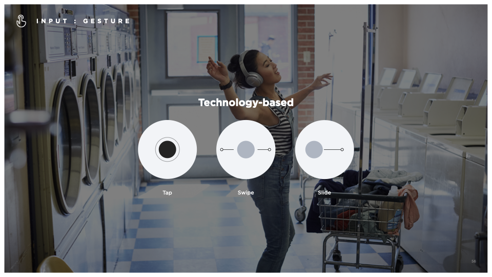
A core area of focus was gesture. We defined what makes a gesture intuitive and low-effort — favoring single-vector, short-duration interactions over ones with multiple twists and turns, and grounding new gestures in metaphors people already carry, like a swipe to dismiss or a sliding scale for volume. Skeuomorphic reference to previously learned behavior wasn't a compromise. It was the on-ramp.
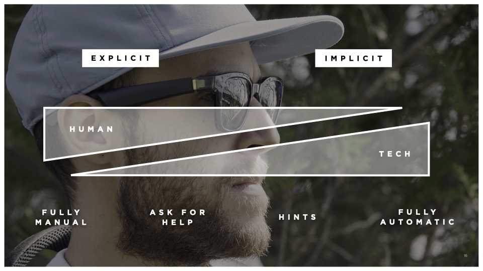
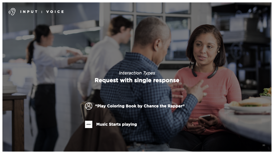
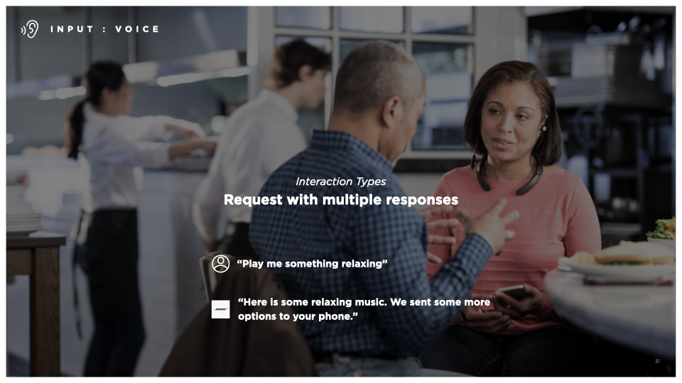
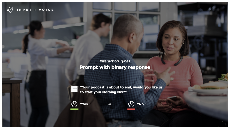
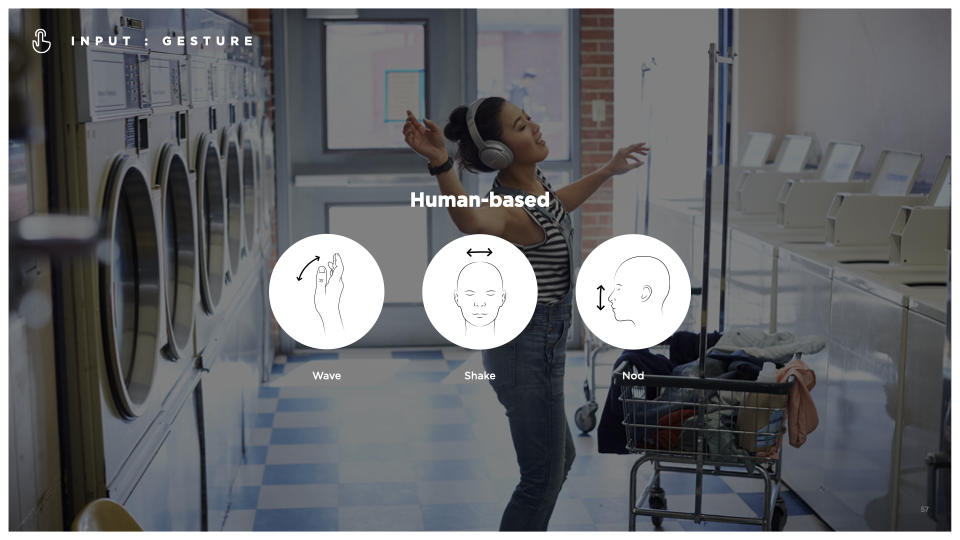
We also wrote for the inputs that don't have names yet — head nods, gaze detection, conversational cues — pointing at a future where interaction feels less like operating a device and more like an exchange. And throughout, the governing idea was restraint. Fewer gestures per surface. Clearer hierarchy. A vocabulary that transfers across the ecosystem instead of flattering a single device.
The document lived in the design studio, with the intent that it would become a living digital reference — updated as the technology moved, as the industry's patterns shifted, as the portfolio grew. Principles like these are never finished. They're maintained.
The hardware that occasioned these particular rules has long since been replaced. The rules haven't. That was the point of writing them down.


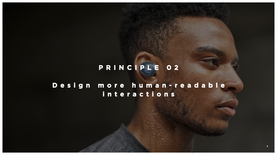
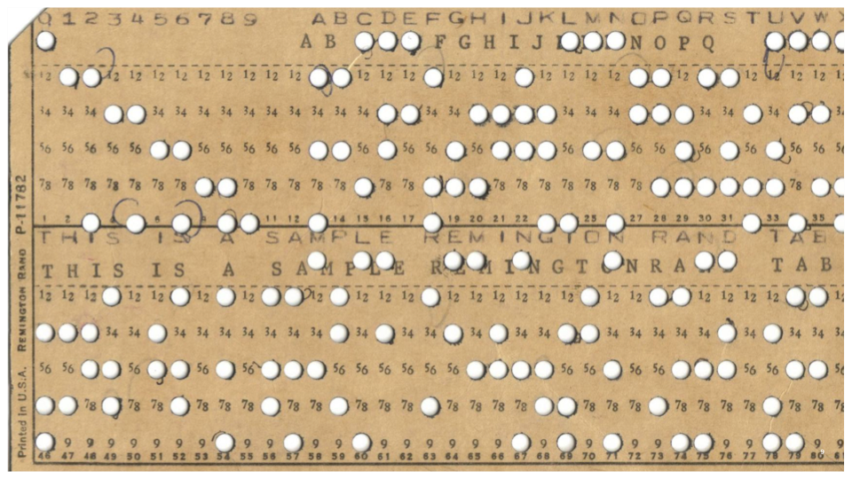
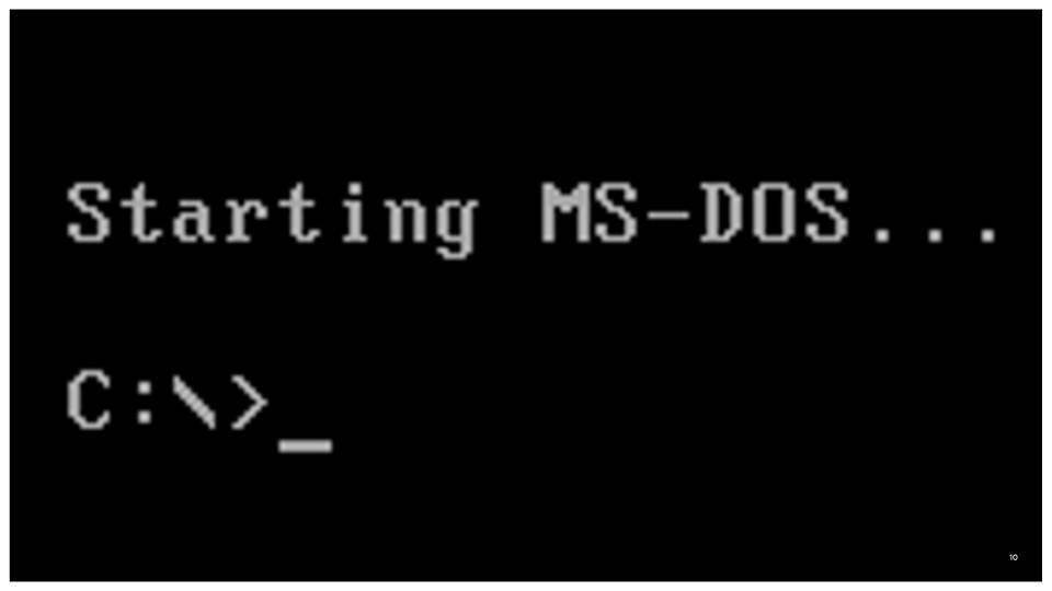
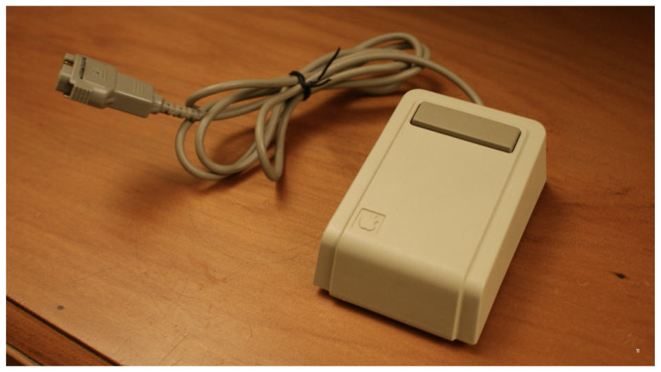
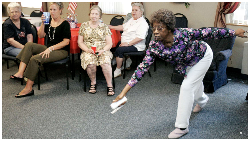
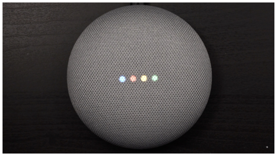

Over time, out User Interfaces have evolved from computer-readable, to human-readable, making interactions more natural, and implicit.