
Visual Language Exploration for a New Tech/Beauty Product
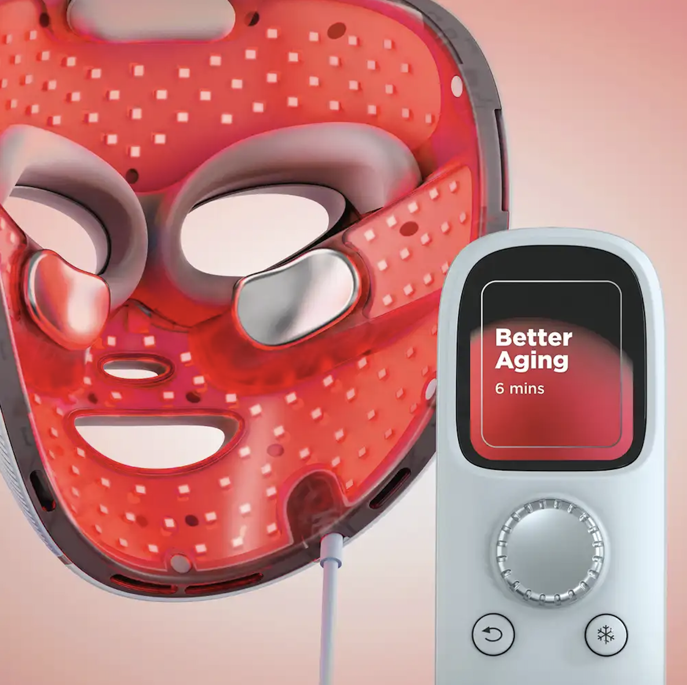
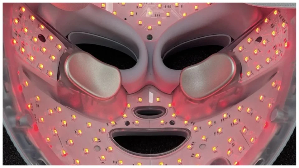
Shark™ CryoGlow™ Red Blue & Infrared iQLED Face Mask
Client: Shark/Ninja
Capabilities Performed
Competitive Audits & Analysis
Visual Language Thematics
Graphic Design
Motion Design
Concept Presentation
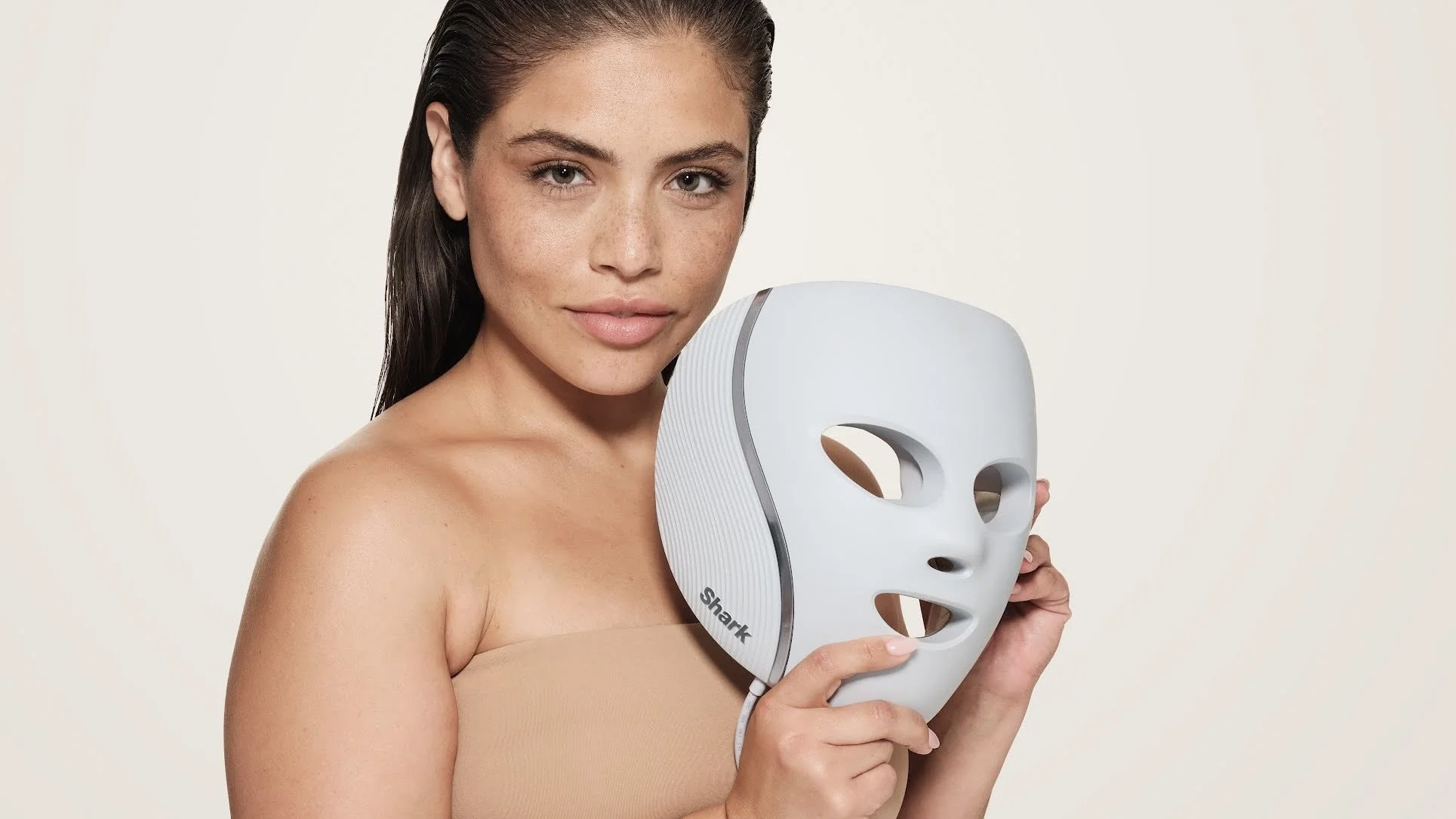
Early in the product development cycle for this new beauty product, I was asked to join the internal team to explore possible visual language directions for use on product (mask, physical remote, and future mobile application), and in marketing materials. This case study captures my process and recommendations for this effort.
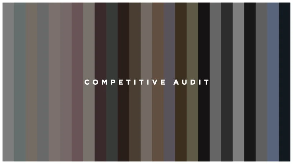
Part 1 : Product Category Competitive Audit
In order to make an informed recommendation to my client, I started with conducting an audit of the visual languages of top performers in the beauty and technology product markets. The brands I evaluated were identified in collaboration with the client so that we were directionally aligned before beginning the effort.
For each brand I created a visual collage that included representative product photography, texture, typography, or any other key visual elements. At the top of each collage I also included a summarized color palette that defines each brand.
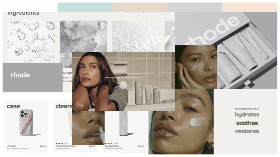
rhode
Rhode is a minimalist, Hailey Bieber-founded skincare and beauty brand launched in 2022, focusing on "glazed" skin, hydration, and barrier repair. It gained rapid cult status with a curated, affordable line (often under $30) featuring peptides, niacinamide, and shea butter. Known for a "clean girl" aesthetic, the brand was acquired by e.l.f. Beauty for $1B in May 2025.
rhode Evaluation
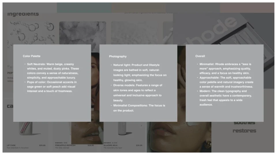
Color Palette
Soft Neutrals: Warm beige, creamy whites, and muted, dusty pinks.exclamation These colors convey a sense of naturalness, simplicity, and approachable luxury.
Pops of color: Occasional accents in sage green or soft peach add visual interest and a touch of freshness.
Photography
Natural light: Product and lifestyle images are bathed in soft, natural-looking light, emphasizing the focus on healthy, glowing skin.
Diverse models: Features a range of skin tones and ages to reflect a universal and inclusive approach to beauty.
Minimalist Compositions: The focus is on the product.
Overall
Minimalist: Rhode embraces a "less is more" approach, emphasizing quality, efficacy, and a focus on healthy skin.
Approachable: The soft, approachable color palette and natural imagery create a sense of warmth and trustworthiness.
Modern: The clean typography and overall aesthetic have a contemporary, fresh feel that appeals to a wide audience.
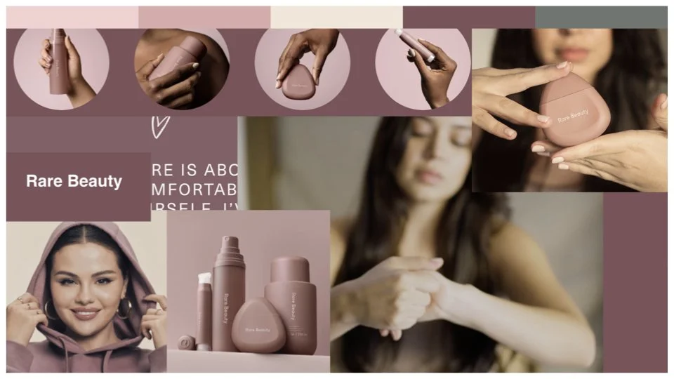
Rare Beauty
Rare Beauty, founded by Selena Gomez in 2020, is a highly successful, mission-driven cosmetics brand focused on breaking down unrealistic beauty standards and supporting mental health. Known for its lightweight, easy-to-use products like the bestselling Soft Pinch Liquid Blush, the brand emphasizes natural, authentic beauty over perfection.
Rare Beauty Evaluation
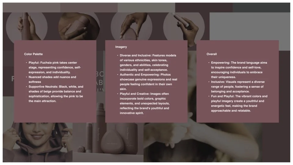
Color Palette
Playful: Fuchsia pink takes center stage, representing confidence, self-expression, and individuality.
Nuanced shades add nuance and softness.
Supportive Neutrals: Black, white, and shades of beige provide balance and sophistication, allowing the pink to be the main attraction.
Imagery
Diverse and Inclusive: Features models of various ethnicities, skin tones, genders, and abilities, celebrating individuality and self-acceptance.
Authentic and Empowering: Photos showcase genuine expressions and real people feeling confident in their own skin.
Playful and Creative: Images often incorporate bold colors, graphic elements, and unexpected layouts, reflecting the brand's youthful and innovative spirit.
Overall
Empowering: The brand language aims to inspire confidence and self-love, encouraging individuals to embrace their uniqueness.
Inclusive: Visuals represent a diverse range of people, fostering a sense of belonging and acceptance.
Fun and Playful: The vibrant colors and playful imagery create a youthful and energetic feel, making the brand approachable and relatable.
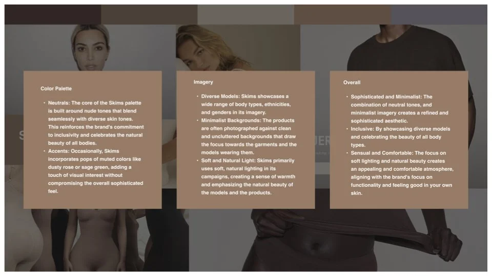
Skims Evaluation
Color Palette
Neutrals: The core of the Skims palette is built around nude tones that blend seamlessly with diverse skin tones. This reinforces the brand's commitment to inclusivity and celebrates the natural beauty of all bodies.
Accents: Occasionally, Skims incorporates pops of muted colors like dusty rose or sage green, adding a touch of visual interest without compromising the overall sophisticated feel.
Imagery
Diverse Models: Skims showcases a wide range of body types, ethnicities, and genders in its imagery.
Minimalist Backgrounds: The products are often photographed against clean and uncluttered backgrounds that draw the focus towards the garments and the models wearing them.
Soft and Natural Light: Skims primarily uses soft, natural lighting in its campaigns, creating a sense of warmth and emphasizing the natural beauty of the models and the products.
Overall
Sophisticated and Minimalist: The combination of neutral tones, and minimalist imagery creates a refined and sophisticated aesthetic.
Inclusive: By showcasing diverse models and celebrating the beauty of all body types.
Sensual and Comfortable: The focus on soft lighting and natural beauty creates an appealing and comfortable atmosphere, aligning with the brand's focus on functionality and feeling good in your own skin.
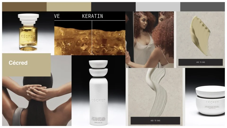
Cécred
Cécred, launched by Beyoncé Knowles-Carter in February 2024, is a premium, Black-owned haircare brand focusing on scientifically backed, high-performance products for all hair types and textures. Combining traditional, generational rituals with advanced science, the line features a patent-pending bioactive keratin ferment to nourish, strengthen, and repair hair.
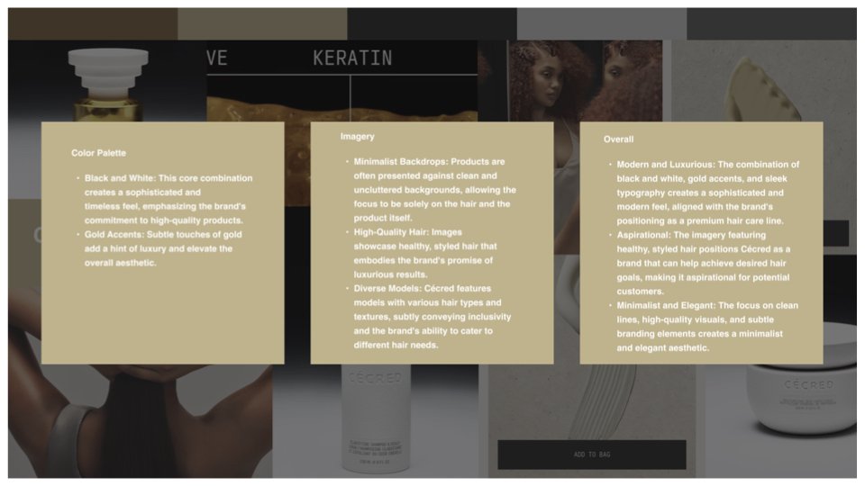
Cécred Evaluation
Color Palette
Black and White: This core combination creates a sophisticated and timeless feel, emphasizing the brand's commitment to high-quality products.
Gold Accents: Subtle touches of gold add a hint of luxury and elevate the overall aesthetic.
Imagery
Minimalist Backdrops: Products are often presented against clean and uncluttered backgrounds, allowing the focus to be solely on the hair and the product itself.
High-Quality Hair: Images showcase healthy, styled hair that embodies the brand's promise of luxurious results.
Diverse Models: Cécred features models with various hair types and textures, subtly conveying inclusivity and the brand's ability to cater to different hair needs.
Overall
Modern and Luxurious: The combination of black and white, gold accents, and sleek typography creates a sophisticated and modern feel, aligned with the brand's positioning as a premium hair care line.
Aspirational: The imagery featuring healthy, styled hair positions Cécred as a brand that can help achieve desired hair goals, making it aspirational for potential customers.
Minimalist and Elegant: The focus on clean lines, high-quality visuals, and subtle branding elements creates a minimalist and elegant aesthetic.
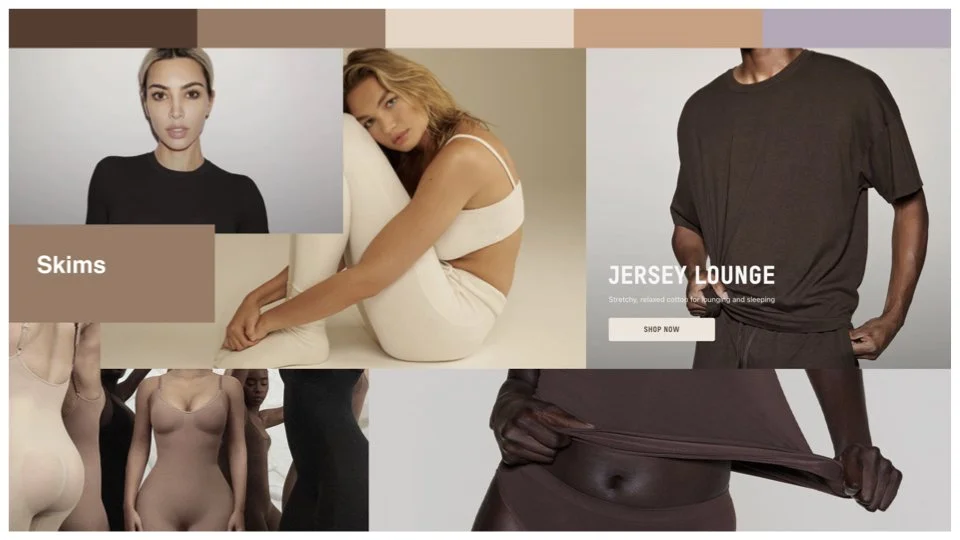
Skims
SKIMS is a high-valuation (over $5 billion in 2025) American shapewear, loungewear, and clothing brand co-founded by Kim Kardashian, Emma Grede, and Jens Grede in 2019. It is renowned for focusing on body positivity, inclusivity, and technical innovation, offering a wide range of sizes (XXS-4X) and skin-tone shades.
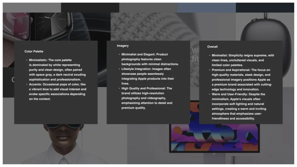
Apple Evaluation
Color Palette
Minimalistic: The core palette is dominated by white representing purity and clean design, often paired with space gray, a dark neutral exuding sophistication and professionalism.
Accents: Occasional pops of color, like a vibrant blue to add visual interest and evoke specific associations depending on the context.
Imagery
Minimalist and Elegant: Product photography features clean backgrounds with minimal distractions.
Lifestyle Integration: Images often showcase people seamlessly integrating Apple products into their lives.
High Quality and Professional: The brand utilizes high-resolution photography and videography, emphasizing attention to detail and premium quality.
Overall
Minimalist: Simplicity reigns supreme, with clean lines, uncluttered visuals, and limited color palettes.
Premium and Aspirational: The focus on high-quality materials, sleek design, and professional imagery positions Apple as a premium brand associated with cutting-edge technology and innovation.
Warm and User-Friendly: Despite the minimalism, Apple's visuals often incorporate soft lighting and natural settings, creating a warm and inviting atmosphere that emphasizes user-friendliness and accessibility.
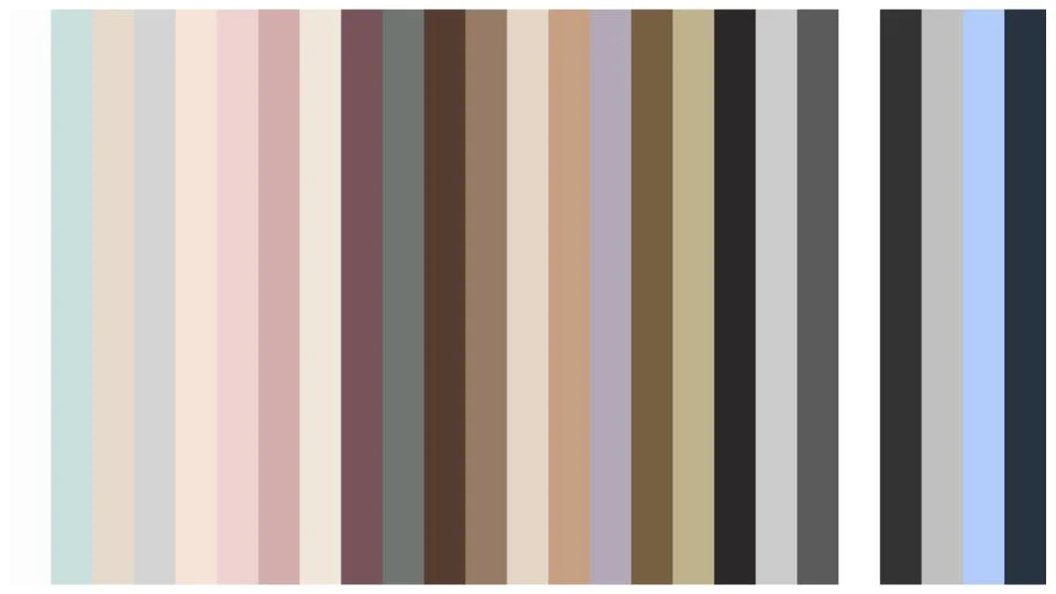
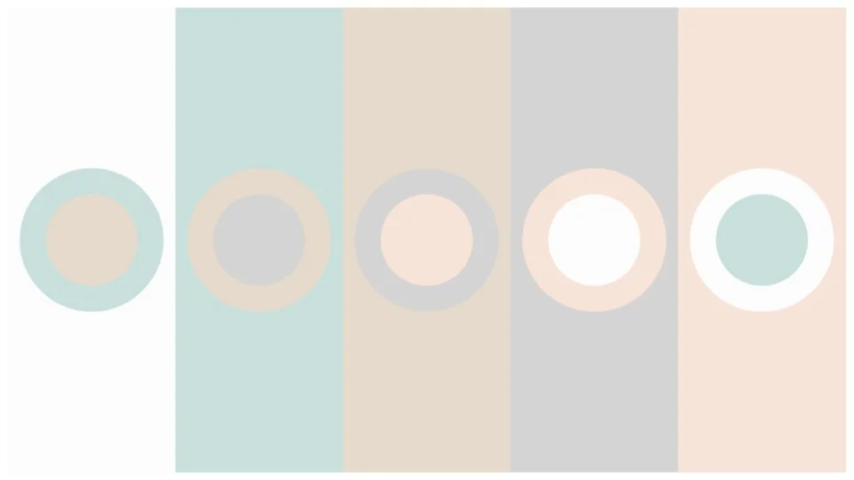
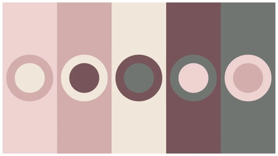
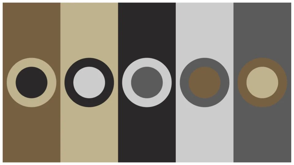
Below is a comprehensive layout of the color palettes all of the competitive brands that were evaluated for this project. The objective of creating this graphic was to provide a birds eye view of the current product landscape to the client.
Part 2: Directional Visual Language Opportunities
After presenting the competitive product landscape evaulation to the client, I set to explore how we might combine what we learned and implement those learnings through the lens of the product my client was building. Below you will see some of the options I presented to the client that might align with their goals, and inspire opportunity for them to stand out in such a competitive field.
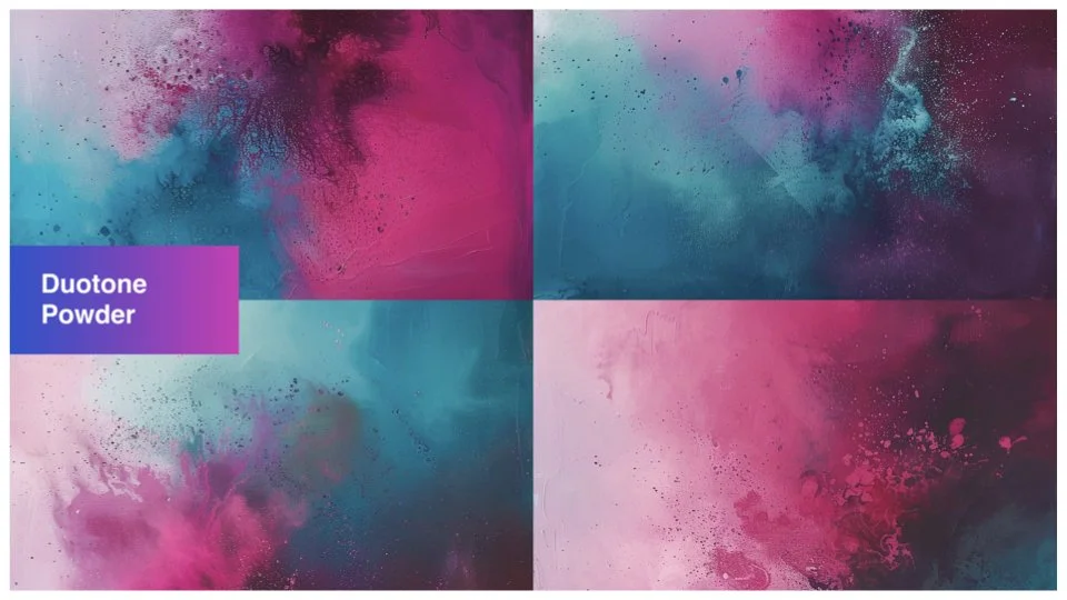
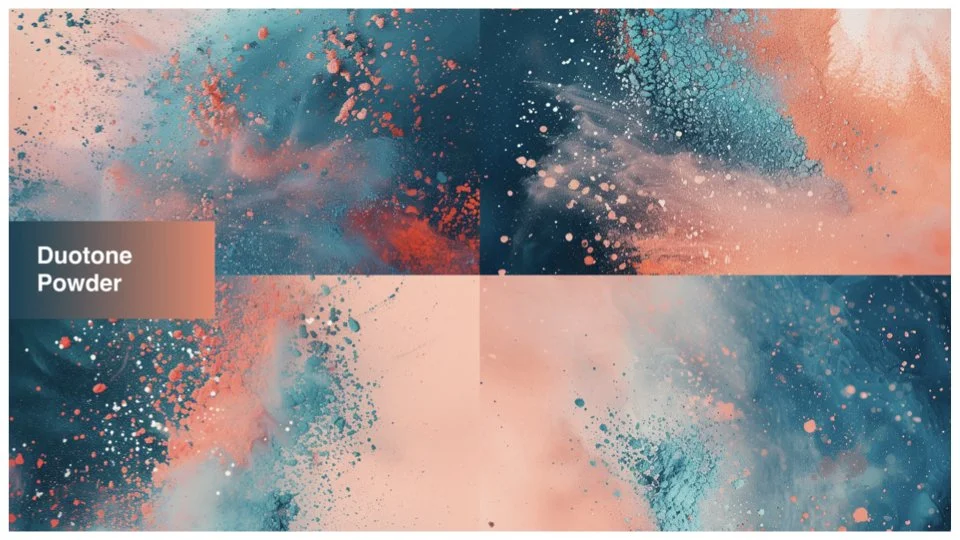
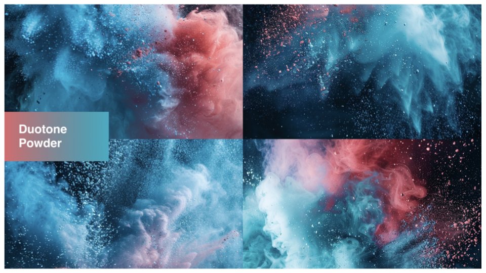
Holi-Inspired
What is Holi?
Holi is the Hindu "Festival of Colors" and "Festival of Love," marks the end of winter and the arrival of spring, celebrating the victory of good over evil. Celebrated over two days in March (following the full moon, or Purnima, in Phalguna), it features lively, colorful street celebrations with powder (gulal) and water, bonfires (Holika Dahan) to banish evil, and the enjoyment of traditional foods and dancing.
The first direction I explored used Holi as a jumping off point. I was excited about the idea of combining the beautiful vibrant colors in alignment with the technological aspect of the product, with the organic nature of the powder that harkened to the organic nature of the beauty industry and their products.
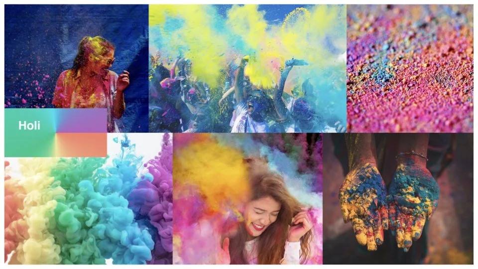
I imaged the powder being a stimulating media, especially when applied to motion. And reducing the color palette to duotone create less visual chaos, but also created opportunities to develop a wide set of color option combinations as a system.
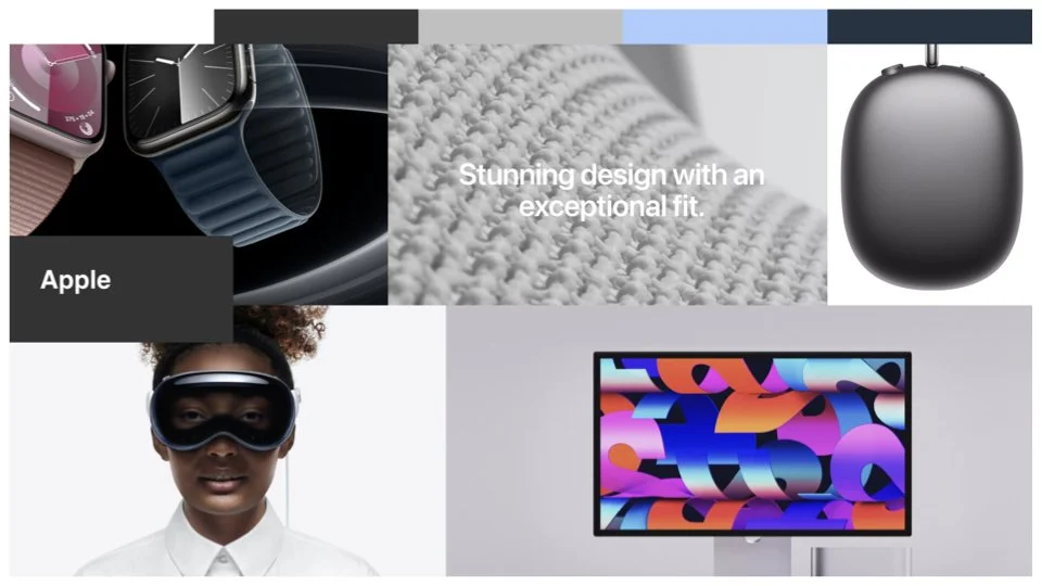
Apple
Apple Inc. is a global technology leader that has consistently redefined consumer electronics through its focus on innovation, design, and user experience. Founded on April 1, 1976, it has evolved from a garage start-up into one of the world's most valuable brands, recently reaching a market cap of approximately $4 trillion in late 2025.
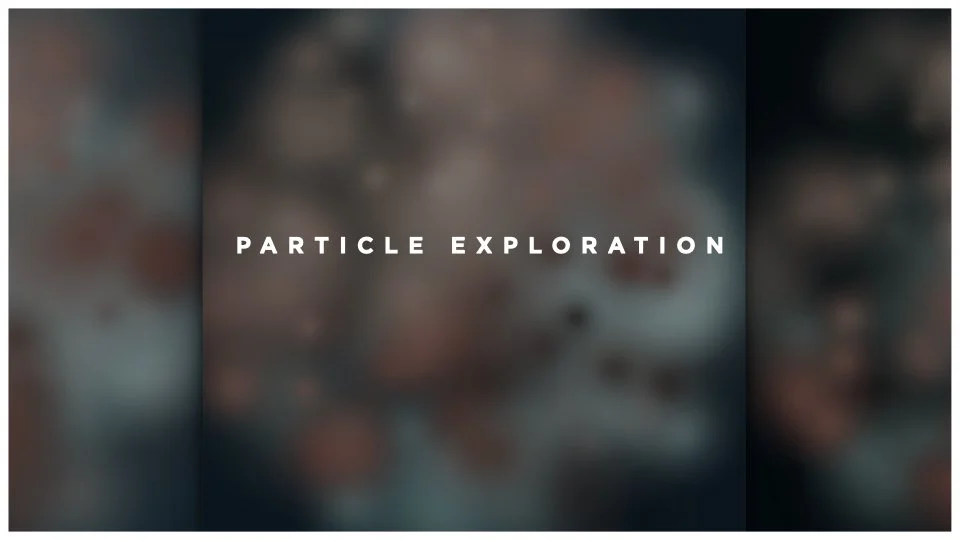
In an effort to further express this visual concept, I created some sketches in After Effects leveraging the Particle System functions. These animations would serve as calming motion graphics during menu selection, mask sessions, or in goal completion celebrations.
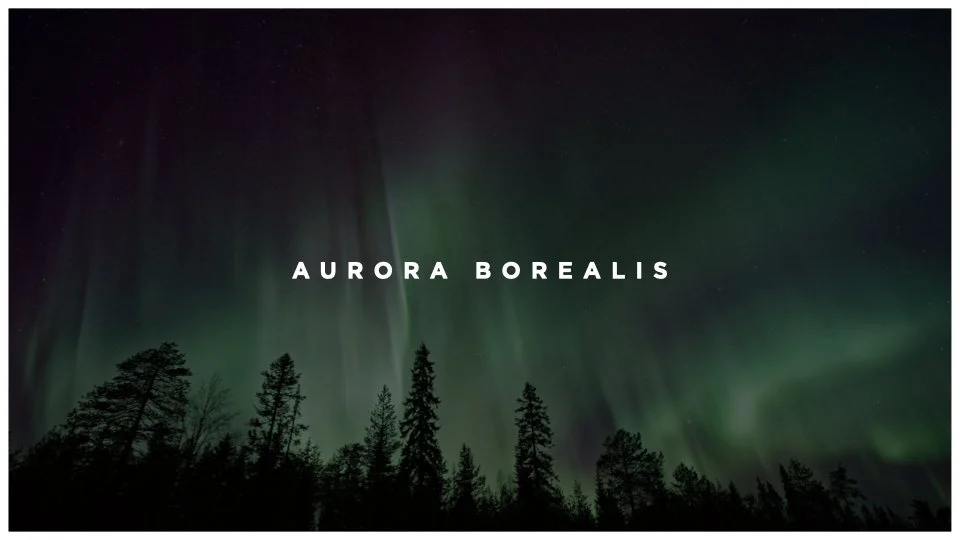
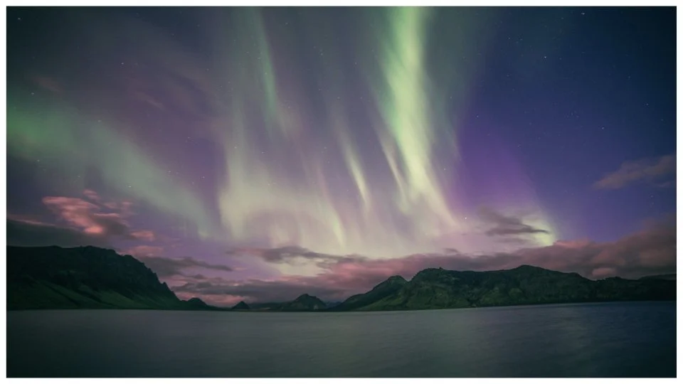
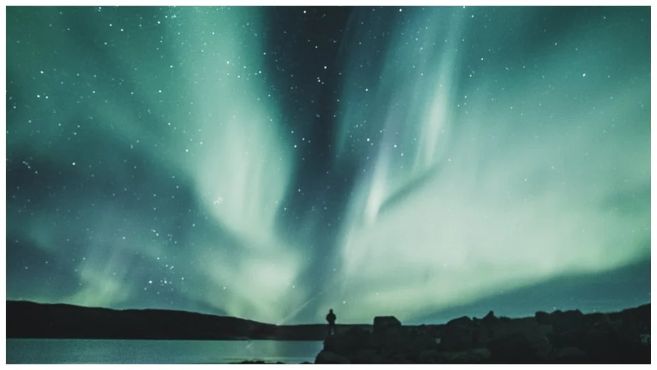
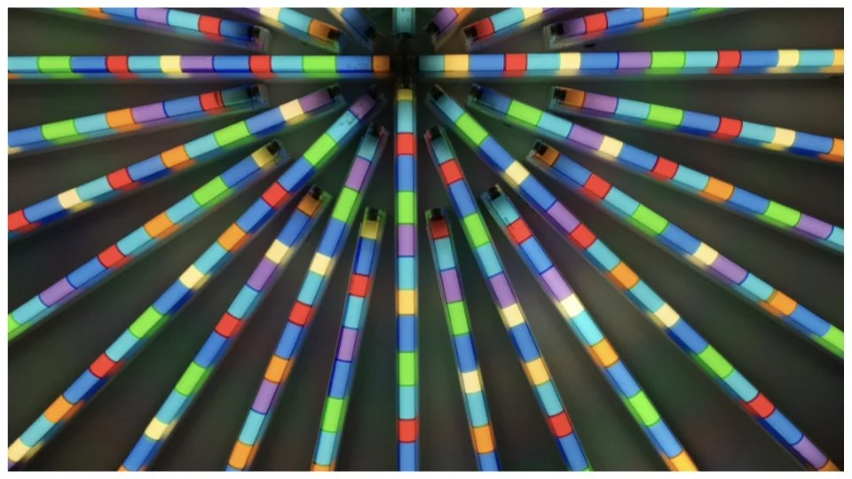
Aurora Borealis-Inspired
What is Aurora Borealis?
The Aurora Borealis, or northern lights, is a natural light display in the sky, primarily occurring in high-latitude regions around the Arctic. Caused by solar wind colliding with Earth's magnetic field, these charged particles excite atmospheric gases (oxygen and nitrogen), releasing vibrant, shifting colors like green, pink, and purple.
This theme seemed like a sure fit, as a scientific marvel, and natural occurence, which bridges similar frontiers of this product in the natural beauty and technological worlds.
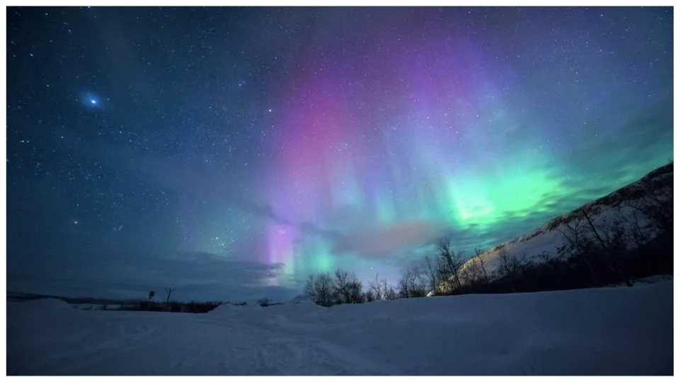
Again, I took to After Effects to explore this visual theme in motion. While I started by more directly mimicking the visuals of the Aurora Borealis, I quickly began to simplify the shapes, making it more conducive for the size of the physical remote.
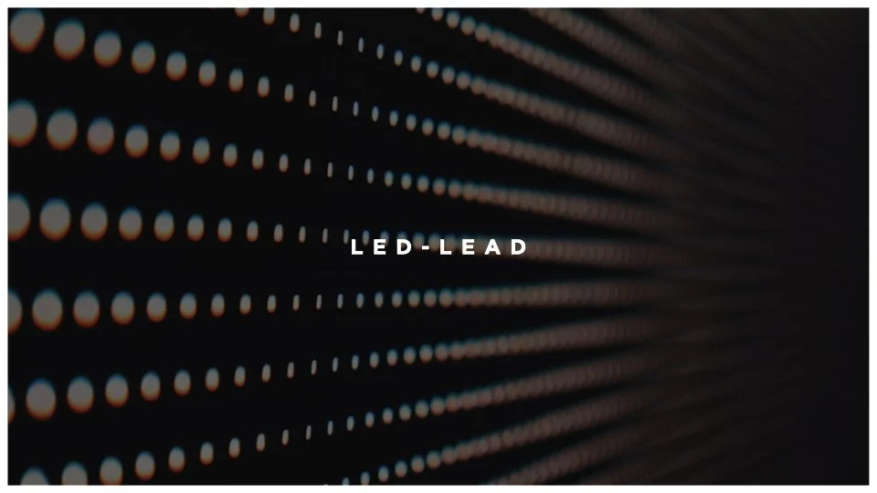
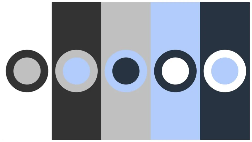
LED Array-Inspired
What is an LED Array?
An LED array is a, "collection of multiple light-emitting diodes (LEDs) arranged in a specific pattern or configuration to produce a desired lighting effect". These units consist of LED packages or dies (chips) mounted on a printed circuit board or substrate, often including electrical interfaces, thermal management, and optical elements for specialized light distribution.
With this visual concept, I looked to the inner-workings of the physical mask for inspiration. The LED array has the potential to create extremely dynamic visuals across a wide spectrum of energy. This theme also helps create a more direct connection between the digital interface of the remote or mobile app, the mask the users are wearing, and the core functionality of the healing process.
While it took a bit of setup, once I had create the infrastructure of a fully manipulable grid of individually addressable dots (harkening to the mask LEDs), I was able to explore various motions, speeds, and colors to help the team visualize options.
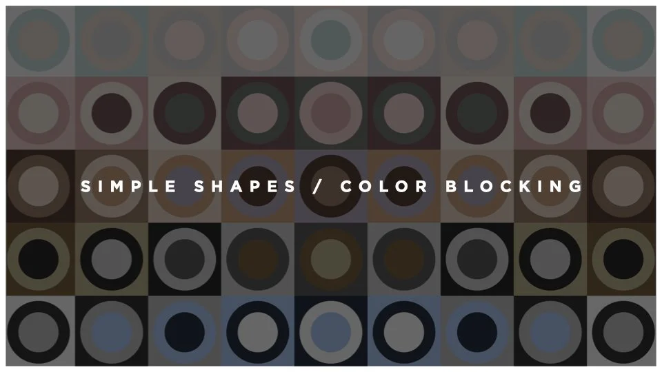
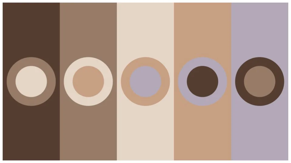
Color Blocking-Inspired
What is Color Blocking?
Color blocking is a design technique that combines large, solid panels of contrasting or complementary colors to create bold, graphic, and visually striking impacts. It is heavily used in fashion (garments with different colored sections) and interior design (geometric wall paint or furniture) to add energy, create a modern aesthetic, and highlight specific areas.
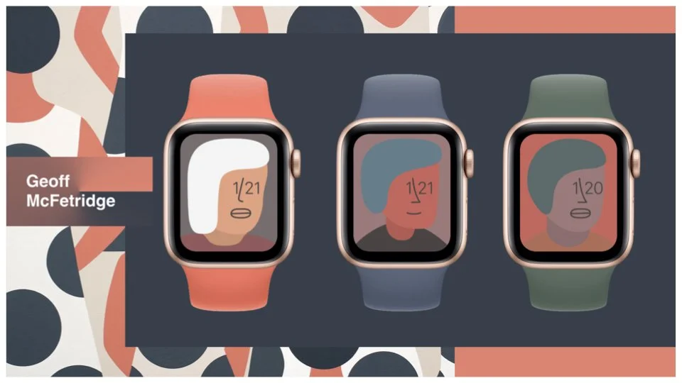
Beyond its foundation in fashion design, I was inspired by the work of Geoff McFetridge (https://championdontstop.com) — specifically his Apple Watch face design. This design was especially relevant given the target display size on the physical remote.
To express this visual concept as quickly as possible to the client, I pulled the color palettes from the brands I evaluated in the competitive audit. For each color set, I create a static set of colors and shapes, and motion examples.
While none of the concepts presented in this case study were chosen directly, I was excited by the discourse it created amongst the team, and the directions that were created from these jumping off points. Another valuable byproduct of this project was the opportunity to dive deep into, and learn about a business category (Beauty) that was new to me. One of the most interesting aspects of design as a practice — that is create countless opportunities to learn and expand your toolkit.